My take is that precipitation amounts are generally handled poorly by the models compared with many other forecast variables. That said, there are some rules of thumb which can help when assessing the prospects.
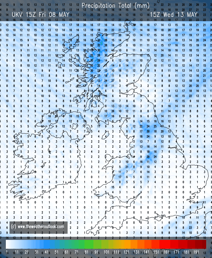
1. ECM and UKV forecasts out to T+120 are worth a look.
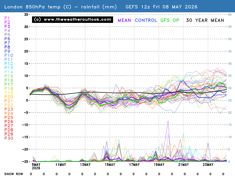
2. GFS / GEFS precipitation forecasts for the UK are often quite poor. With the GEFS, I don't think it's worth spending too much time focusing on the amounts at longer ranges, but they do have some value in identifying the "big picture", for example, whether it will be turning wetter or drier.
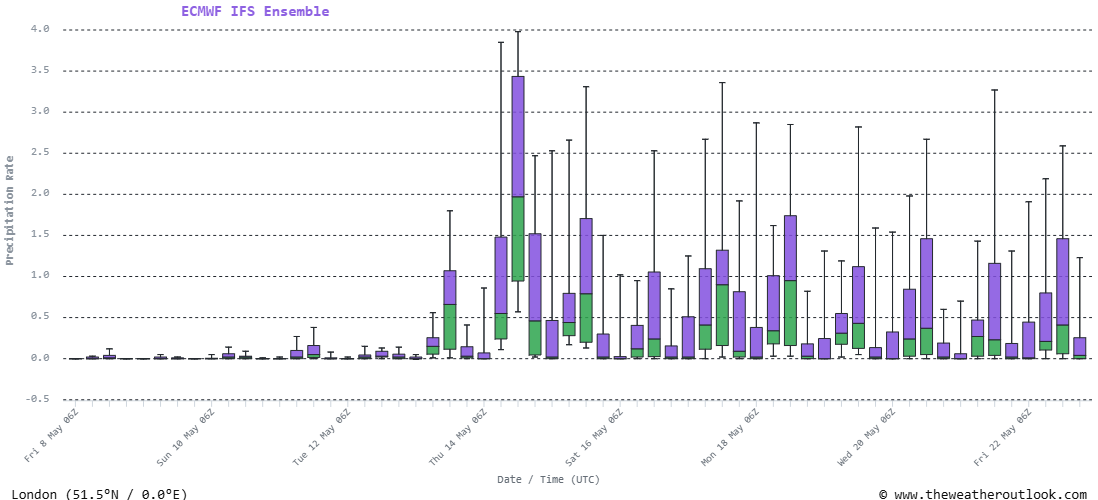
3. The ECMWF IFS ensemble is probably the best freely available tool for forecasting medium-range precipitation amounts in the UK.
How the data is presented is another question. For point 1, the simple grid point-based charts are probably the best.
For 2 and 3, I like either the data tables and the box and whisker charts. However, a lot of people seem to stick to the graphs, perhaps because they're more familiar and widely available.
Originally Posted by: Brian Gaze